


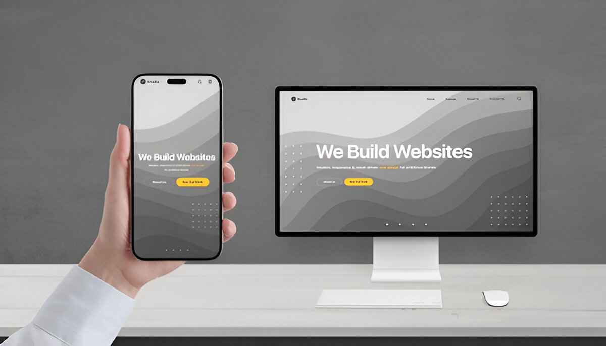
Responsive web design ensures your website looks great and works perfectly on all devices, including smartphones, tablets, laptops, and desktops. With most users browsing on mobile, responsive design has become a key factor in website success.
What Is Responsive Web Design?
Responsive web design allows a website layout to automatically adjust based on screen size. This is achieved using:
- Flexible layouts
- Media queries
- Scalable images
- Mobile-first design principles
Why Responsive Design Is Important
A non-responsive website creates poor user experience and higher bounce rates. Responsive websites:
- Improve user engagement
- Increase mobile traffic
- Boost SEO rankings
- Reduce maintenance costs
Google also prioritizes mobile-friendly websites, making responsiveness essential for search visibility.
Mobile-First Design Approach
Mobile-first design means designing for smaller screens first and then scaling up. This approach ensures:
- Faster loading speed
- Better content focus
- Improved usability
SEO Advantages of Responsive Websites
Responsive design improves:
- Page speed optimization
- Lower bounce rates
- Better search engine rankings
- Higher conversion rates
Conclusion
Responsive web design is no longer optional. It improves user experience, SEO performance, and overall website success. Every modern website should be built with responsiveness in mind.

